Where do I start? Great topic!
Even as a kid, for some of the cardback art I was like what the heck? It was usually for the secondary characters because when I saw who they were making, I thought "wow, I wonder what picture they will use" given the fact the character had little screen time.
Since I was a kid, I also didn't know a lot about air brushing and other art techniques but I did clearly notice that the photo was doctored in many ways. I think Kenner selected great photos- some iconic and some perfectly different than what was used on other forms of merchandising but on some cards they got out of hand with the air brushing where it was unneeded.
I'll point out a couple of the ones that really bother me and then compare a couple that are really great for what and how Kenner got it right even though some people may not like them. I'd also like to point out that back then, Kenner didn't have a ton of technology and photographs to utilize and they did the best they can. It's amazing that with only the intention to sell action figures and not having to worry about appeasing adult collectors, they pumped out amazing packaging designs where sometimes the live photo stood out more than the figure. Besides the figures, I feel cardbacks are always second to my heart when I collect.
Cardbacks that annoyed me:
Gamorrean guard- the airbrushing was unneeded and made him look neon when you compare to the original photo which can be seen in Topps Rotj series 1 "court in chaos!"
http://www.tradingcarddb.com/Images/Cards/Non-Sport/72969/72969-35Fr.jpg
I know they had to take out the background characters but no need to mess with the Gam. Plus Gam has tons of other photos to use
Walrus man- similar to Gam Guard, I've seen the original photo which I think was a black and white photo and had kabe standing next to him so I know why they did what they did. They had to make b/w color. Again, they could have used the many nice shots of walrus man that came from the holiday special. They did that for snaggletooth because when I was little, I picked up on the fact that the snaggletooth pic isn't even part of the movie. Add to the fact that particular snaggletooth isn't even in Star Wars a new hope. But his cardback is great!
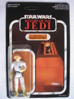
Boba Fett Roth desert scene- I love that some of the classic characters got new life with a 2nd photo once the 77backs came out. Except they had to give boba legs which never existed and a disgusting long green cape! Great pic to use and in some ways it has become one of boba's main pictures but ugggg! The airbrushing makes me hate it. I wished even more the POTF version came out because the correct photo fits in the potf design.
Klaatu- same fate as gamorrean guard. What was the need? I'm glad they made a fix in the Vintage Collection.
Dengar- way too blurry. What happened to QC sign off?
Cross sell/vehicle art- A-wing/B-wing/Tie pilots and the At-at commander/at-st driver all suffered this fate. I wanted to see the man behind the machine portrayed.
I felt that with the airbrushing, sometimes they did when it wasn't needed and in other cases they didn't do it when they would have but It ended up looking fine anyway like Lobot's cardback.
In comparison, here are some cardbacks I felt worked out very well
Other blurry cardbacks- 4-lom, rebel commander, etc. some characters are so mysterious or probably had a hair second of screen time that taking a suitable photo for them would turn out a little blurry.
At-at driver- could have went the vehicle route especially since he was released before at-at commander and they didn't
Ewoks- probably a pain to locate pics for all those unknown ewoks and the found good enough cardback photos (even though paploo is wrong
")
)
Boba Fett- I alway thought the space scene background worked well for the mysterious character they added to line before empire came out. Made it look like this guy can fly around in space without a ship.
Darth Vader/Ben- both used these dark backgrounds rather than their original Death Star backgrounds which made it look like they had a secret duel in a cave
Potf line- the smaller box that profiled the picture perfectly worked to capture the central character and eliminate the background that Kenner would of probably air brushed out given a larger frame. Characters like yak face and ev9d9 benefited.
Anakin skywalker- some hate it but I always liked it because the air brushed art really makes him look like a spirit